
The Bridge app is a beautifully designed app, I was lucky to work with the folks at Meedan who are incredible designers. We developed lots of custom transitions, like table cells expanding to become the full-screen detail view. Or a full screen collapsing into a tab bar icon with a genie effect that had the tab bar icon dancing for a second.
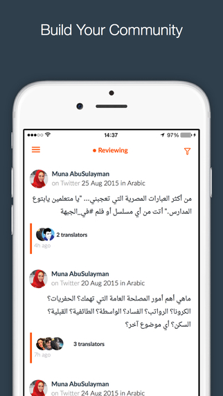
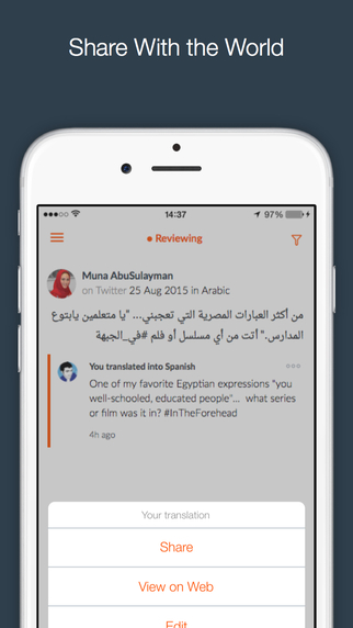
The Bridge app talks to a RESTful api to get feeds of posts, translations, glossary terms that are contextual to the content being translated, submit translations, review translations and configure user preference.
Some of the challenges we confronted while developing this app were:
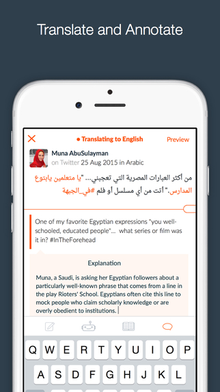
Localization: Beyond UI localization, the app had to support displaying and creating text in multiple languages including right-to-left languages like Arabic.
Space: During translation, the user needs to switch back and forth between source text and target composition. They also need to be able to keep track more or less of where they are on the source text. Sometimes the source may be long and sometimes short, deciding how to use the screen real estate in a way that accommodates a variety of situations was hard. We opted for a smart screen divider which would appear only when needed which the user can adjust. The divider has built-in behaviors that cause it to automatically adopt certain positions based on where the user is in the composition process.
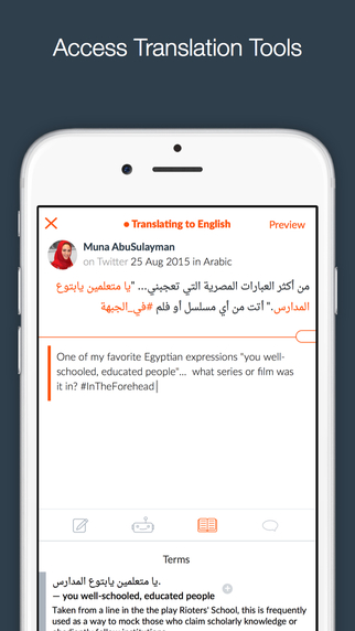
Translation Tools: We wanted to use the keyboard area to present translation tools such as glossary and machine translation. It was no obvious how to switch back and forth across tools and keyboard.
My role:
I led the development of the Bridge iOS app which was built by myself and 1 other engineer.